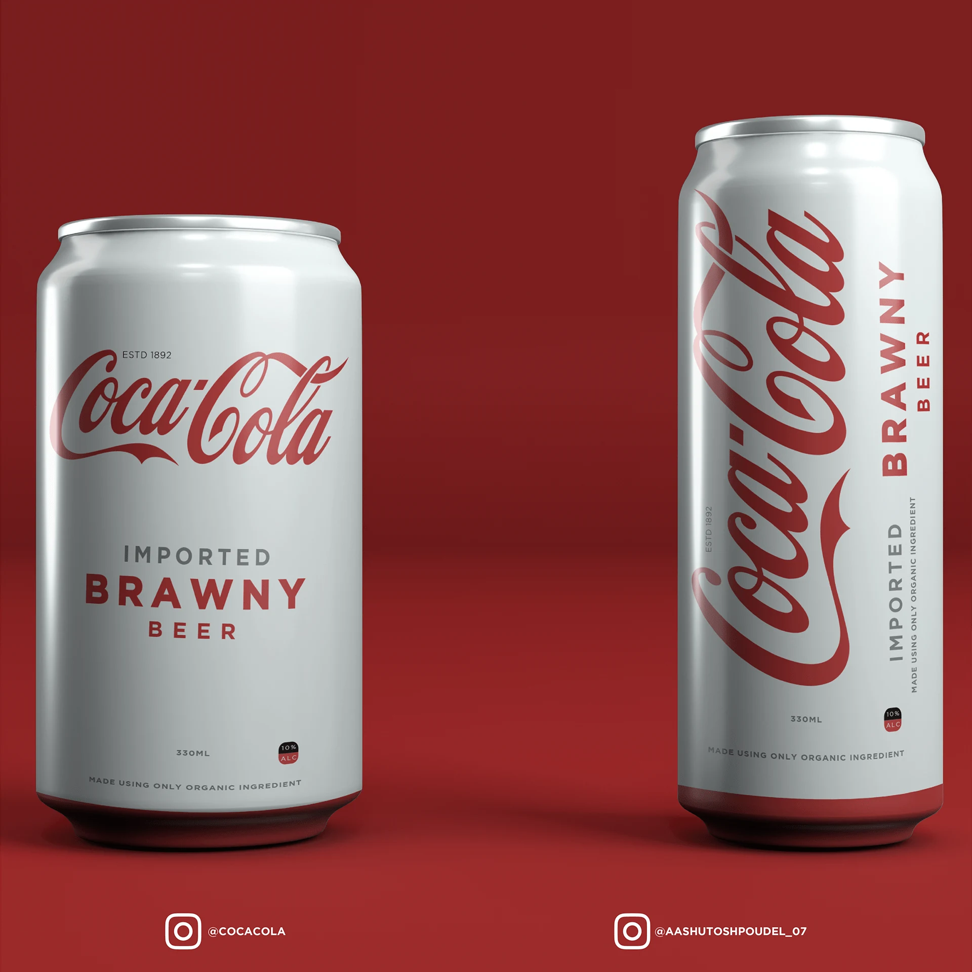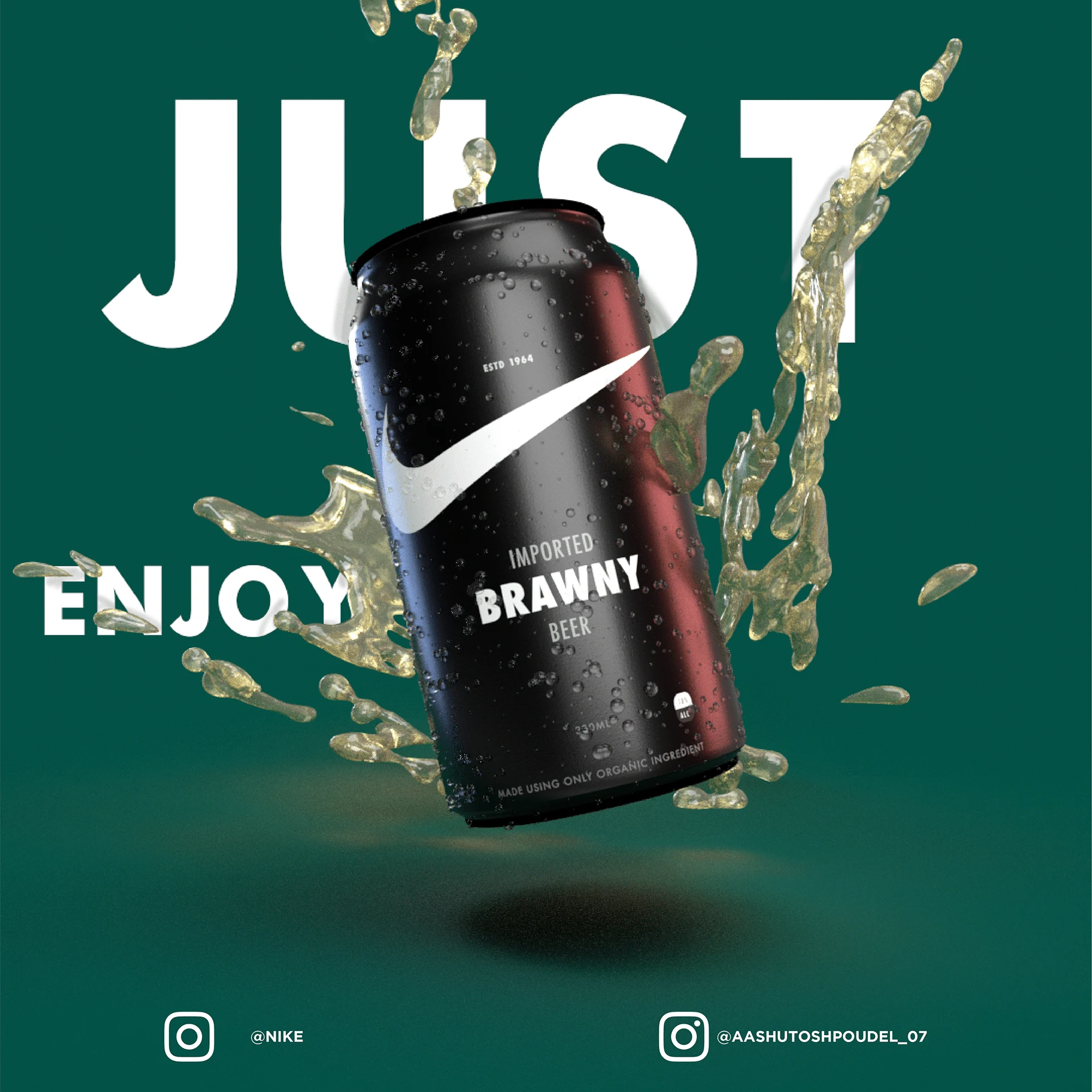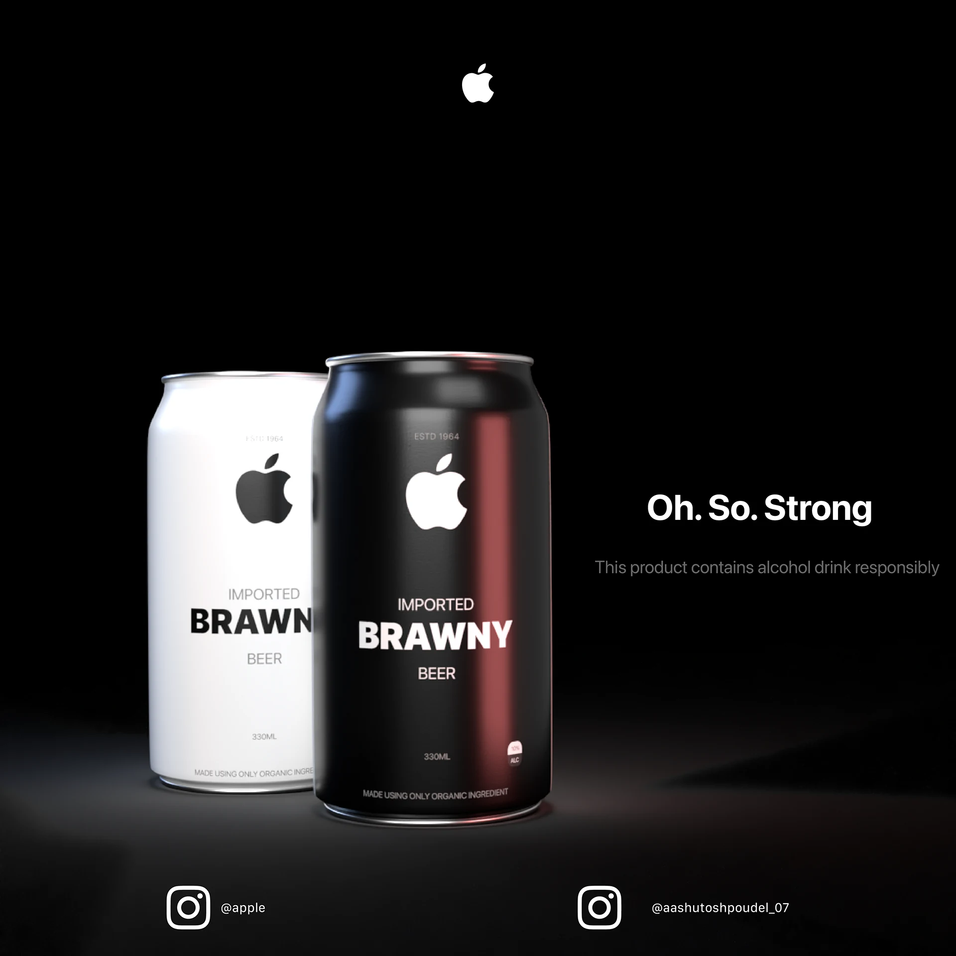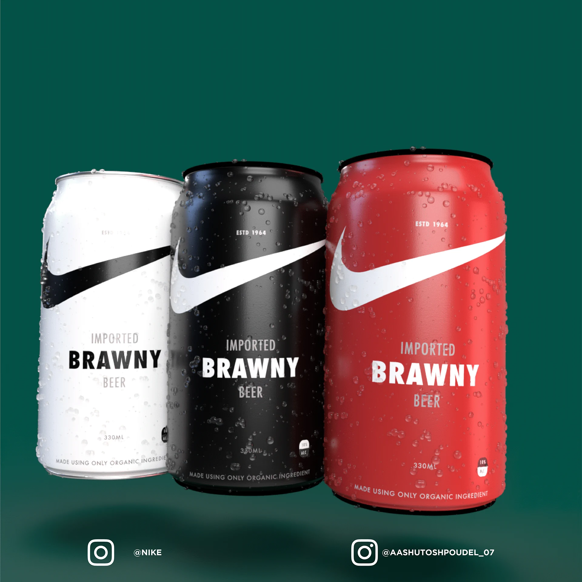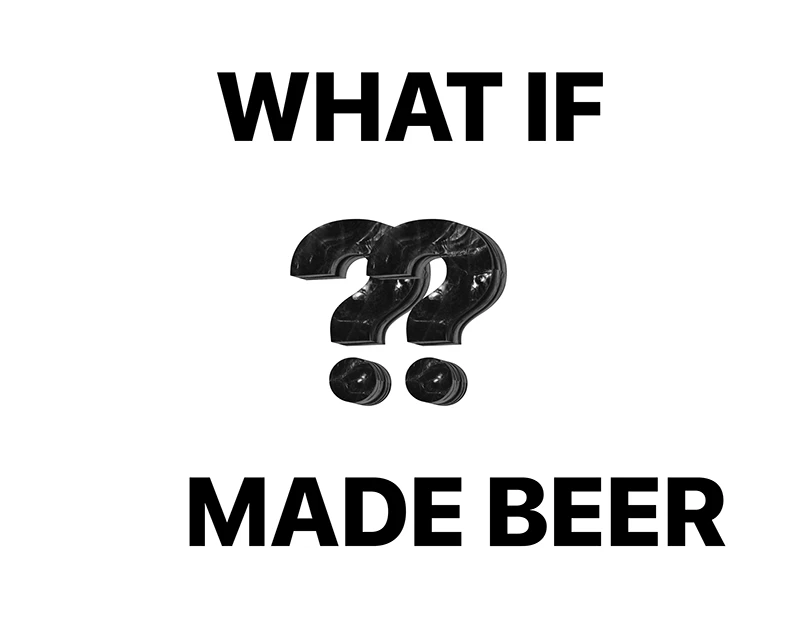
What if famous branding visuals in beer packaging

Projects / What if

What if

Problem

Wanted to create a playful campaign that reimagines what iconic brands would look like if they made beer, that feels believable and engaging.

The challenge was to make each beer feel like it could belong to that brand — not just look like a familiar logo placed on a can.
Solution

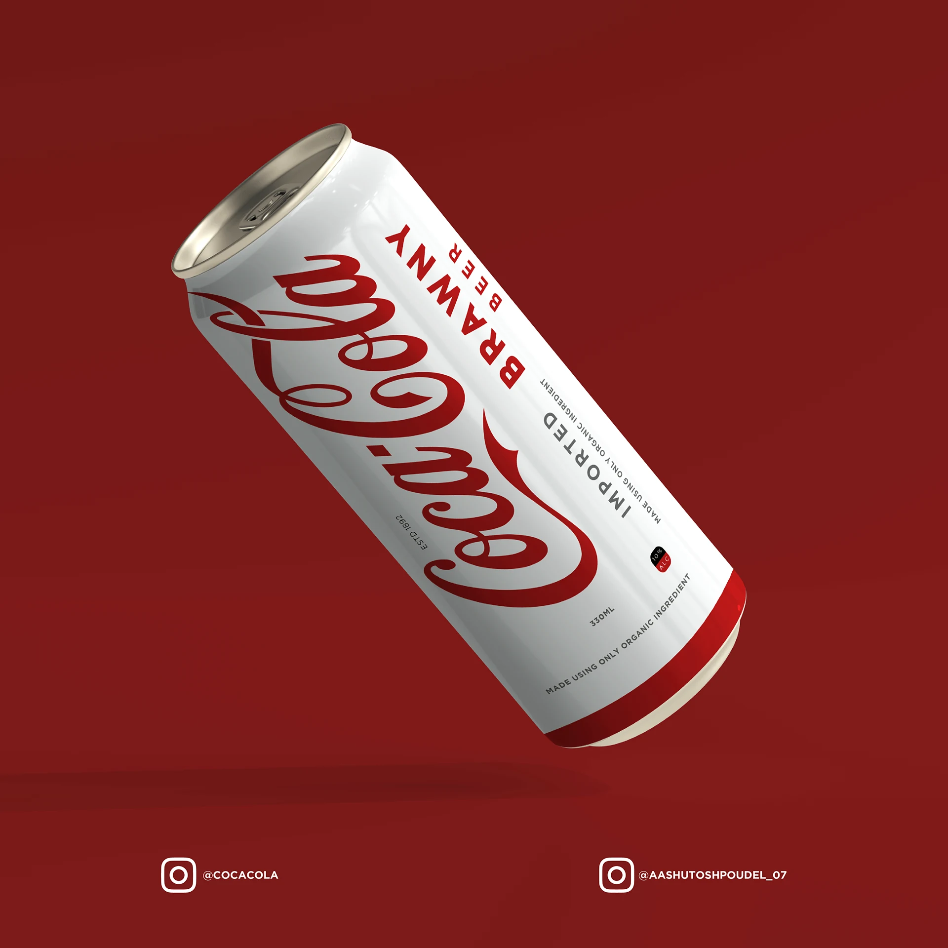
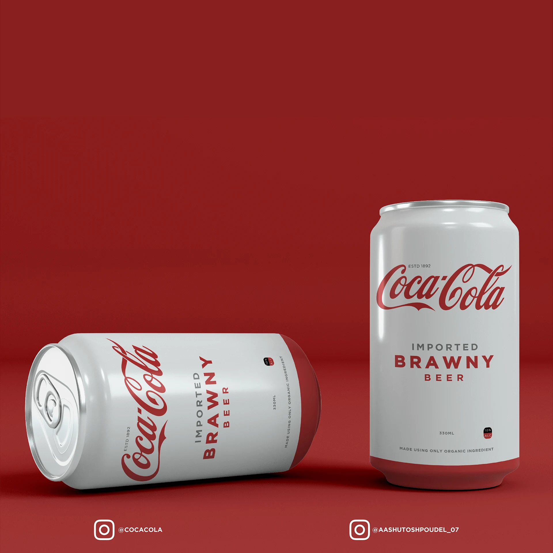
I translated each brand’s visual language into beer packaging, campaign copy, color, composition, and product attitude.

The campaign turns brand recognition into a playful question: what would this brand taste, feel, and advertise like as a beer?

02 / Process

Decision
story

01
Finding the hook

Recognition before explanation

The campaign starts with a direct question: “What if this brand made beer?” That gave the work an immediate hook because viewers can understand the concept before reading any long description.

02
Translating brand energy

Each brand needed its own beer mood

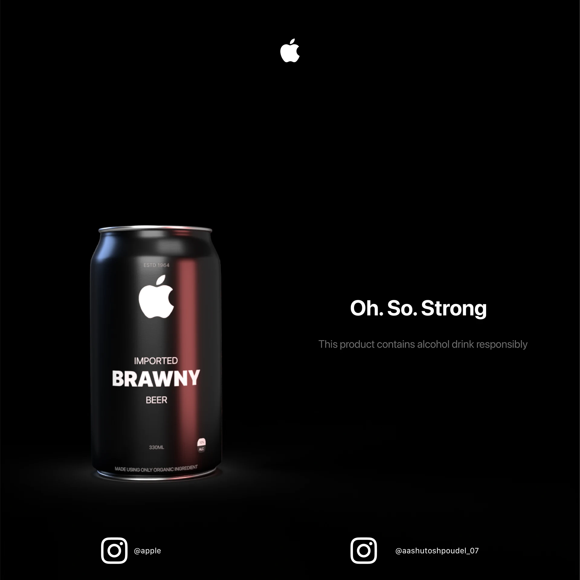
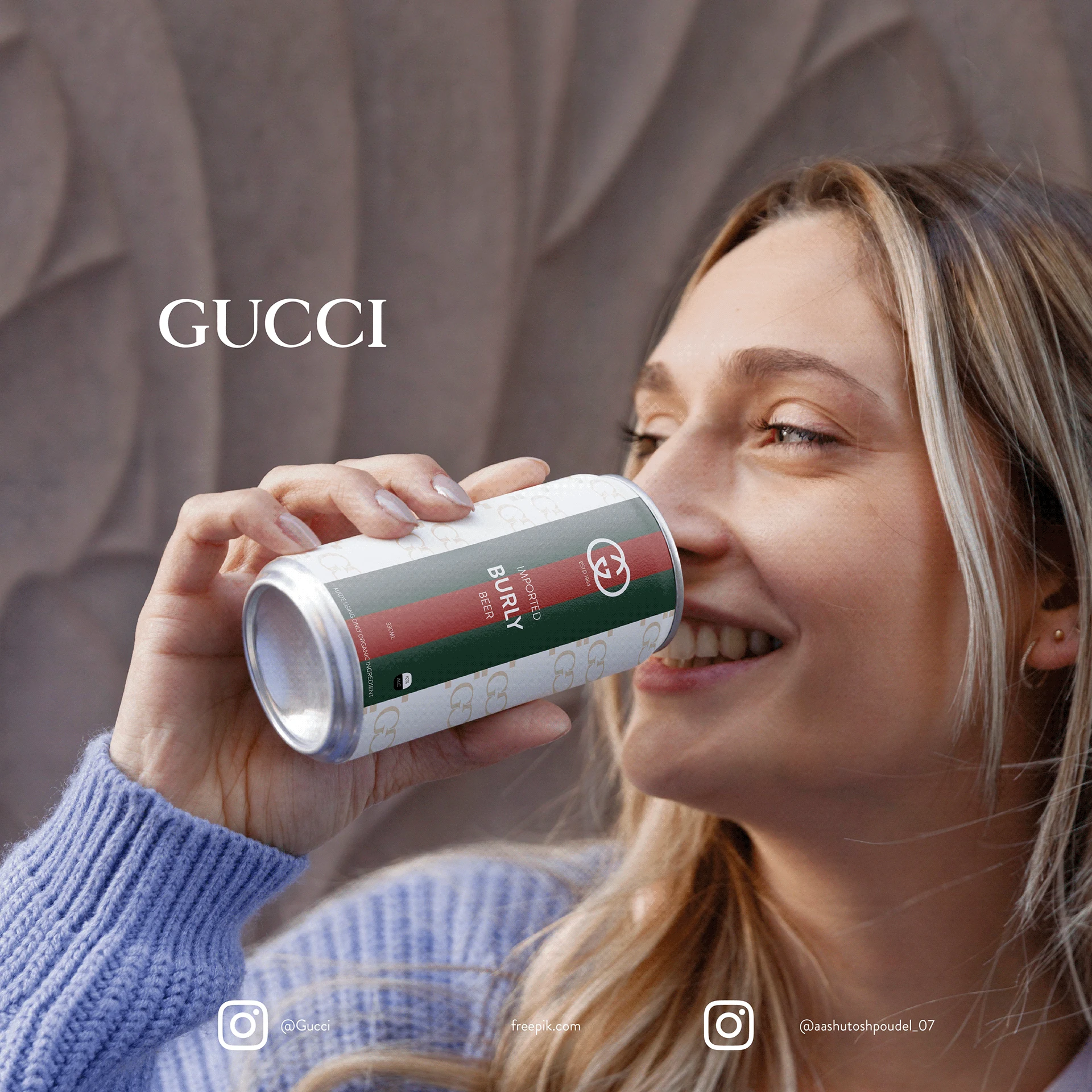
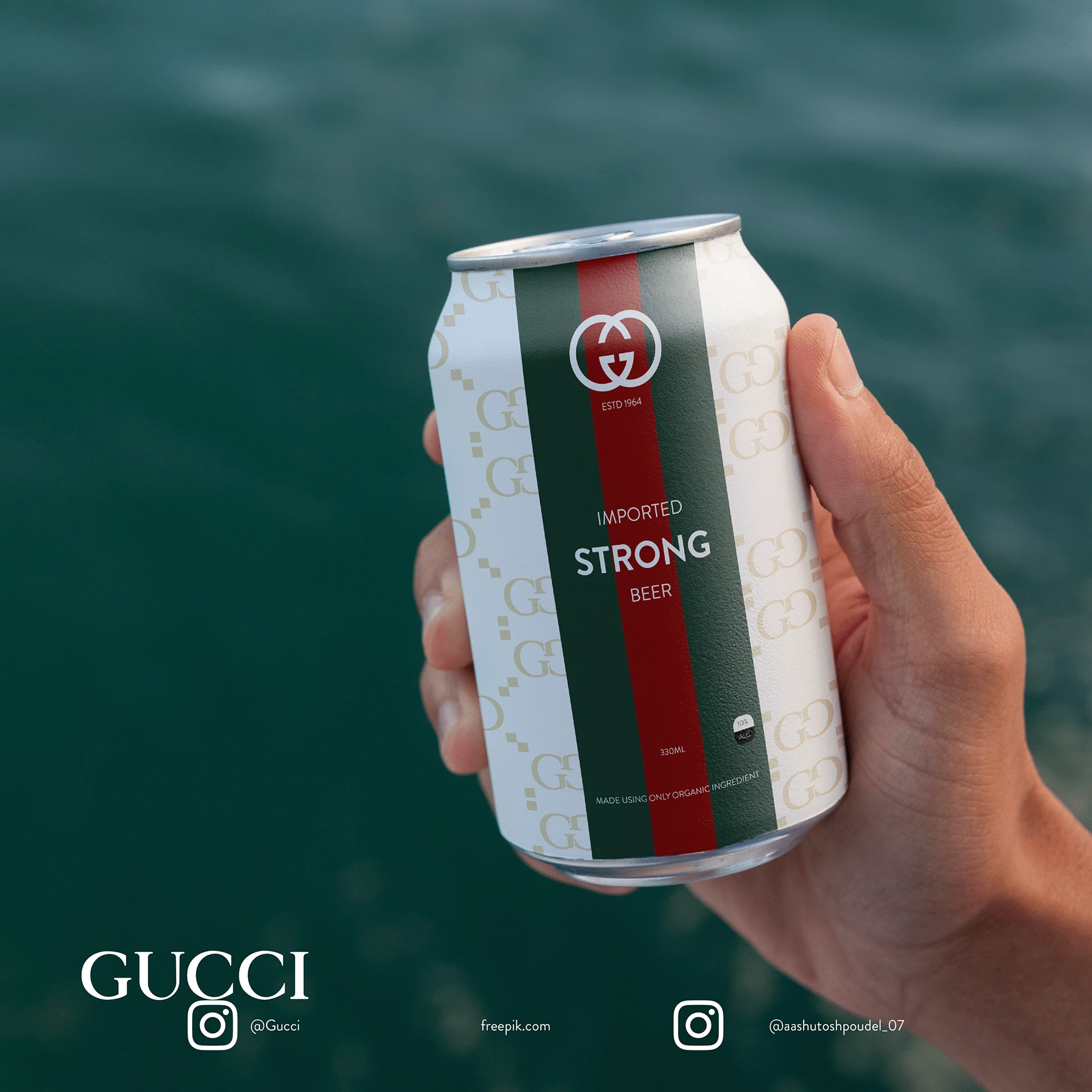
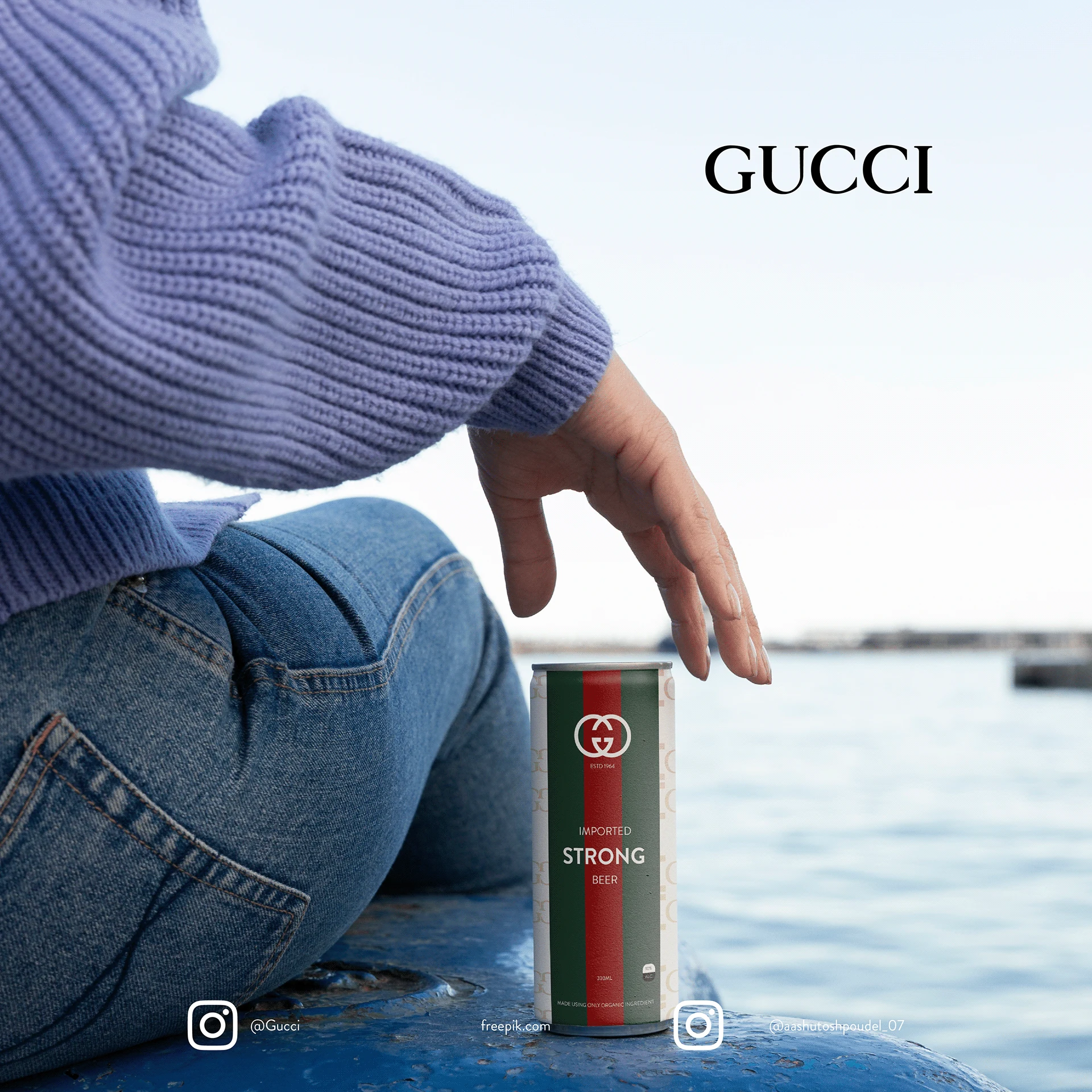
Nike became bold, active, and energetic. Gucci became premium and lifestyle-driven. Apple became minimal and controlled. Coca-Cola became classic, red, and familiar.

03
Designing believable packaging

Not just a logo on a can

I treated the beer can as the main product surface. The colors, scale, typography, product names, and label placement were adjusted so each can felt like a complete product concept.

04
Creating campaign moments

Make the ads feel scroll-stopping

I used bold poster compositions, product mockups, lifestyle scenes, and short copy to make each concept work as a social ad, not just a packaging exercise.

05
What this proves

Advertising is translation

The final direction shows that a strong campaign idea is not only about making something funny or unexpected. It is about translating a brand’s personality into a new product category in a way people understand quickly.

03 / Evidence

Visual
proof

04 / Outcome

Impact
signals

Since this is a personal/spec campaign, the impact is measured through concept clarity: how quickly the idea can be understood, repeated, and adapted across multiple brand worlds.

4
Brands
3
Formats
2
Color Tones
05 / Reflection

This project taught me that a clever idea only becomes a strong campaign when every detail makes the concept feel believable.

Back to
All projects
← All projects