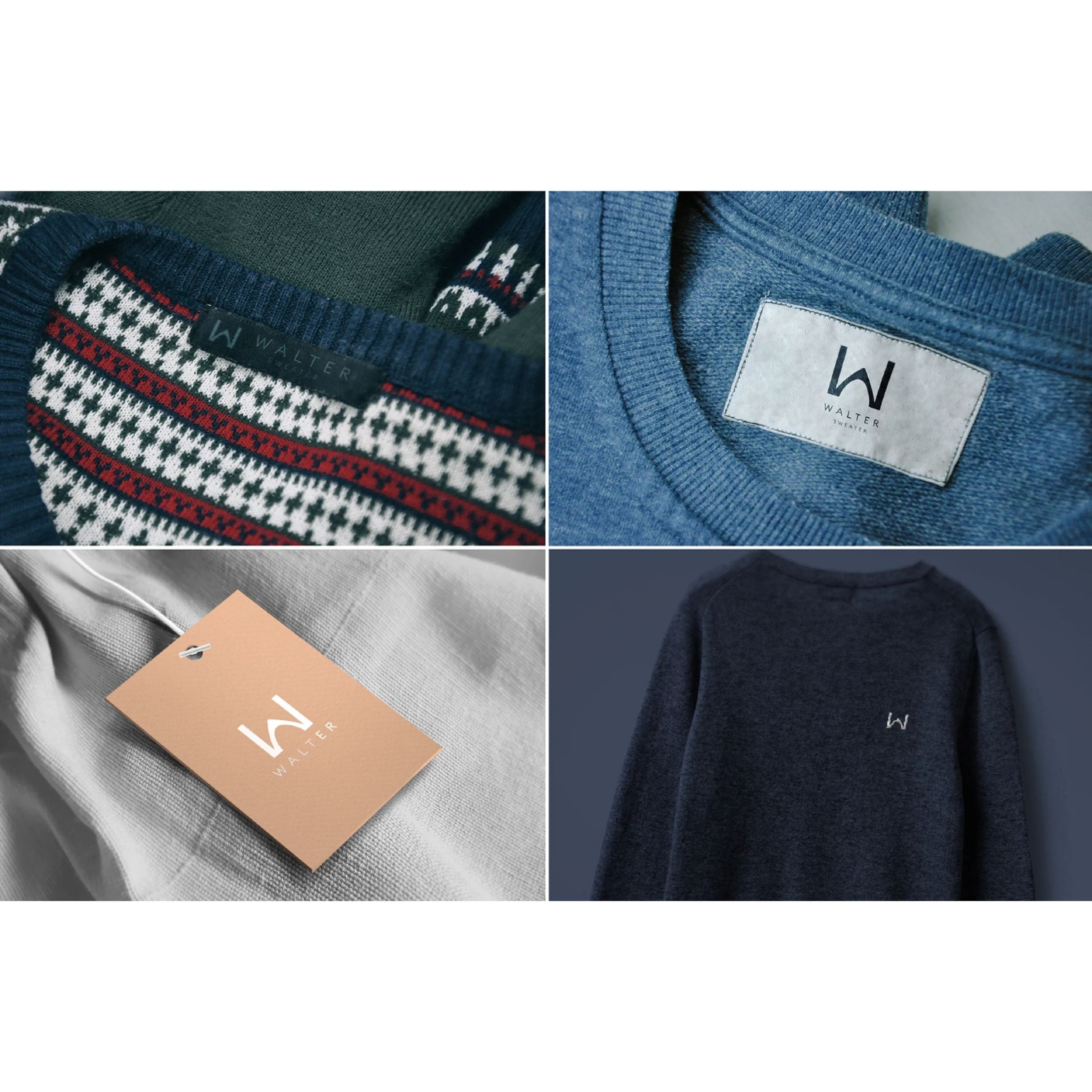
Walter casual fashion branding visuals

Projects / Walter Casual Fashion

Walter Branding

Problem

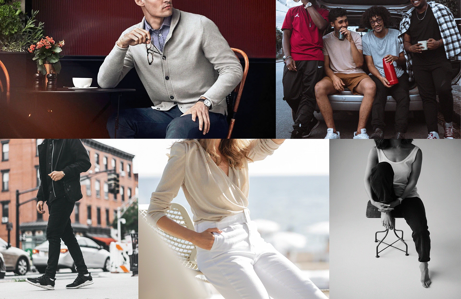
Fashion is all over the place and is always changing, but fashion brand doesn't clearly answer: “Does casual fashion have to be over or under sized?”

The challenge was to make casual fashion feel accessible and approachable to all and make it fashionable.
Solution

Create a brand that focuses on casual, custom-tailored clothing for modern consumers. The brand should be approachable.

The branding should be simple, clean, and modern, with a focus on brand values. The logo should be versatile and easily recognizable, while the overall visual identity should evoke a sense of comfort and confidence.

02 / Process

Decision
story

01
Defining the gap

Custom clothing needed a clearer identity

Walter was positioned around custom-tailored casual wear, but the brand needed to feel more than functional. The identity had to communicate comfort, fit, confidence, and personal style without becoming overly decorative.

02
Creating recognition

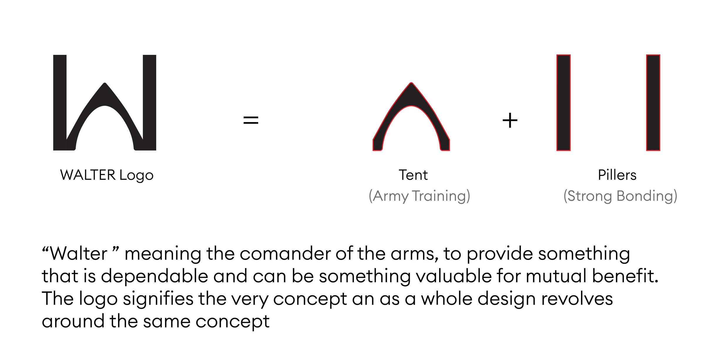
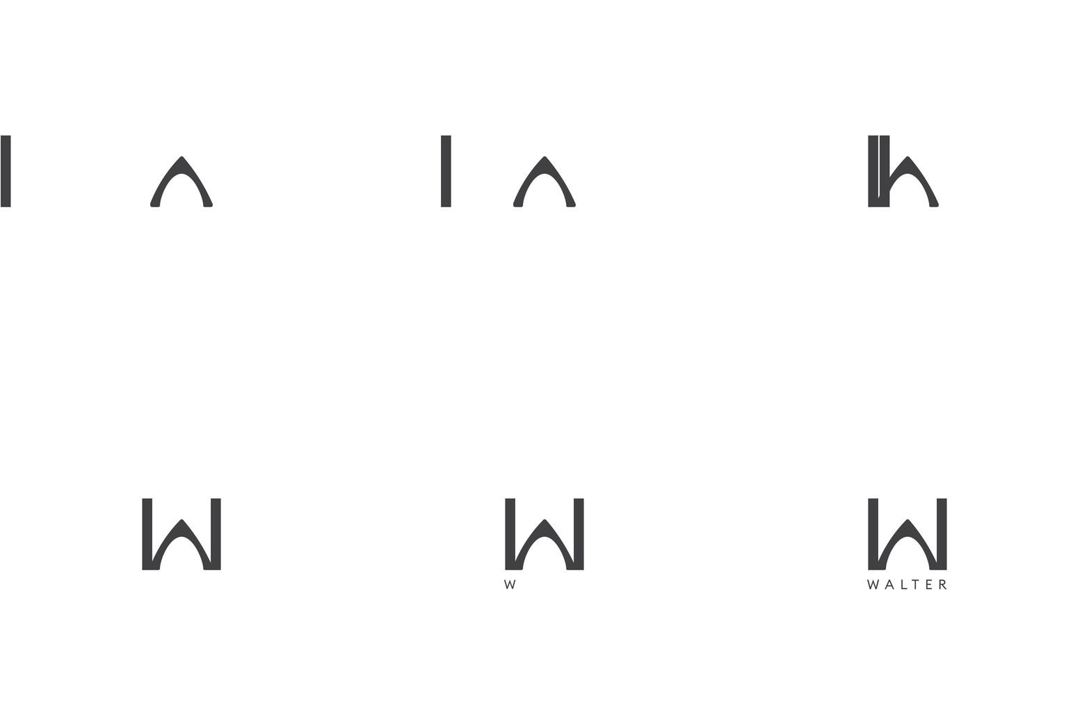
A simple mark people could remember

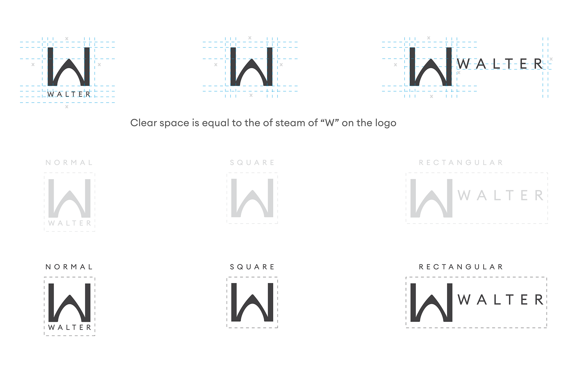
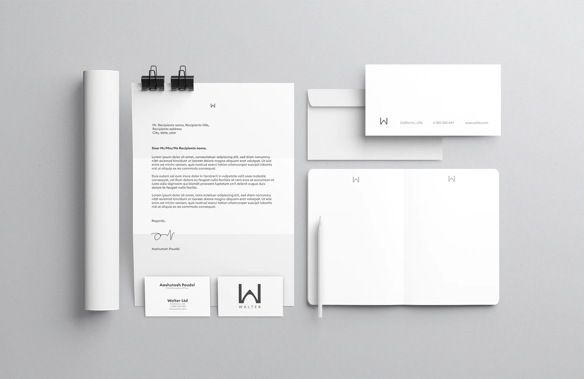
I focused the identity around a minimal “W” mark. The goal was to create a symbol that could work on signage, tags, packaging, digital materials, and clothing details without losing clarity.

03
Building the brand system

From logo to usable identity.

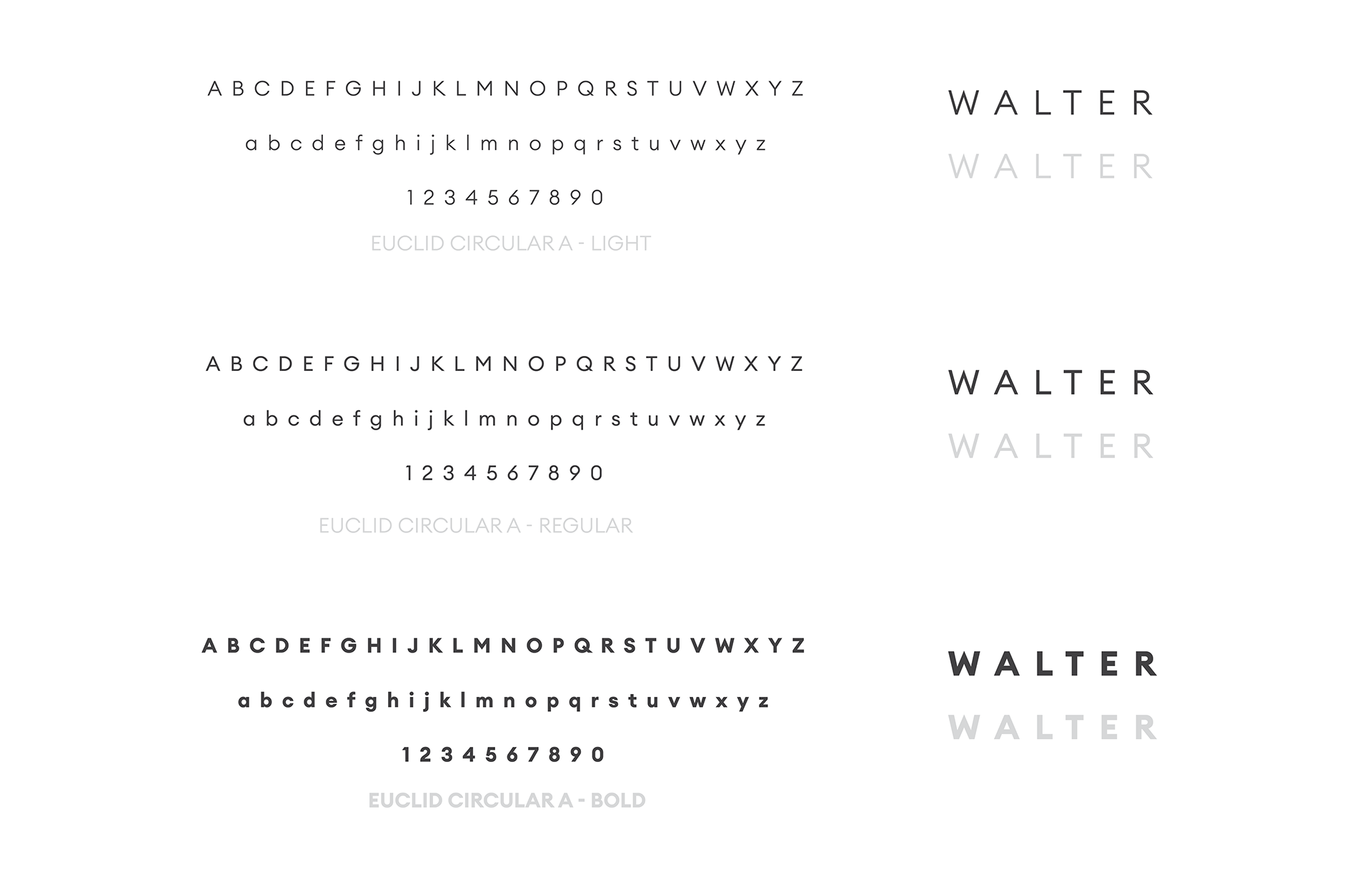
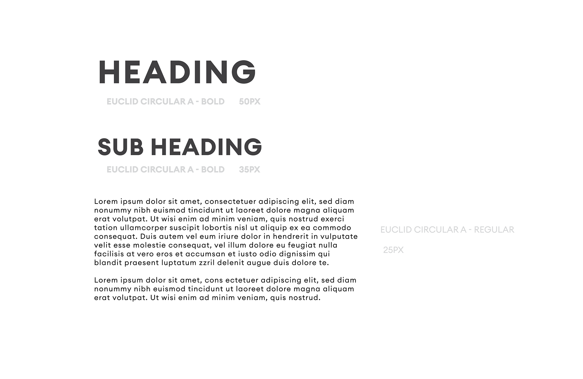
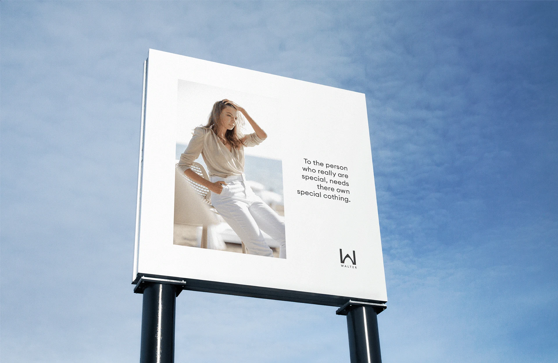
The visual system was extended beyond the logo into typography, color, spacing, packaging, and display materials. This helped the brand feel consistent whether someone sees it on a storefront, a clothing tag, or a digital brand piece.

04
Testing real-world presence

The identity had to work in public spaces

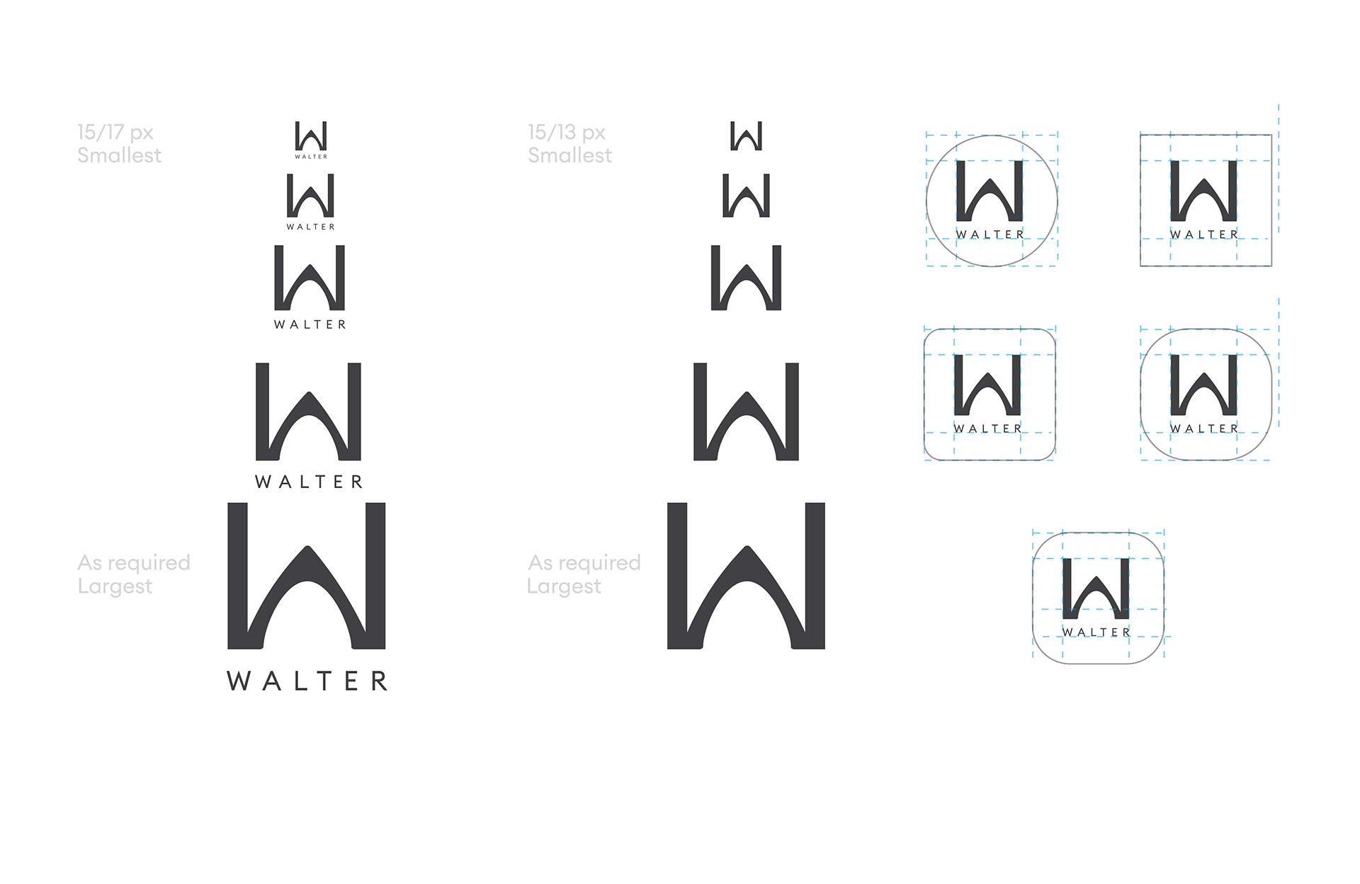
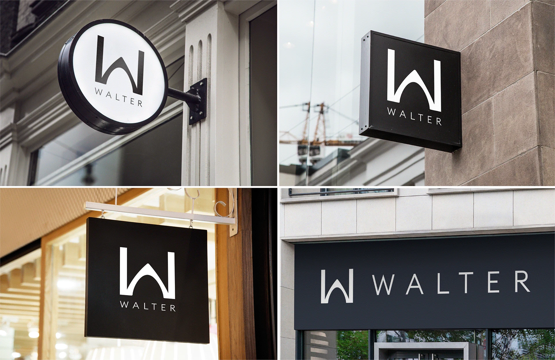
used signage and retail-style mockups to check whether the mark stayed readable at different sizes, distances, and placements. The black-and-white direction helped the identity feel premium, flexible, and easy to reproduce.

05
What this proves

Brand identity is a usability system.

The final direction was not only about making Walter look polished. It was about making the brand easier to recognize, apply, and trust across every place a customer might experience it.

03 / Evidence

Visual
proof

04 / Outcome

Impact
signals

Since this is a brand identity concept, the impact is measured through system clarity: how easily the identity can be recognized, applied, and repeated across real brand touchpoints.

1
Clear Mark
3x
Easier Application
2
Color Tones
05 / Reflection

A strong identity is not built from one beautiful logo. It is built from repeated moments of recognition across every place the brand appears.

Next
What If
← All projects